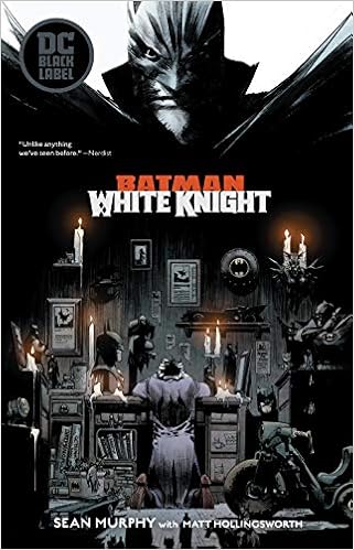
This is a really good graphic novel, its an original idea with an interesting story and really shows joker in a different way. To me this novel is a great example of how to tell a story and characterization.

This was the reference I want to use to create my own animation for my characters, the reason why is because the animation uses each scene from the novel to bring each scene to life.
:max_bytes(150000):strip_icc()/italy--venice--elevated-view-of-canal-in-city-543346423-59812f179abed50010eeb207.jpg)
I found to use Venice as reference and an inspiration to create the city for my novel. The reason why we have had cities that were very grounded or in space, but we never had one that was floating on sea and moving. Also Venice is a city on water so I thought that’s an interesting idea, so I took inspiration to create my own city.
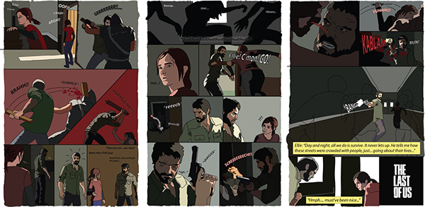
This is comic strip for the critically acclaim game “The Last of Us”, this really is an interesting look of how to tell a story. It gives the viewer an idea of what a comic should look like and not to put detail in before you want to create a final draft.


What makes a villain a great villain? To really make a great villain you have the character to be human, like Vulture, he was a man that was only try to provide for his family even if it meant breaking the law. This character was more grounded and was an actual human being, everyone loves a villain who is human and his or her motivations are understandable. The joker was a mastermind that was able to go through with plan even if batman thought he was able to defeat him. villains shouldn’t be generic cookie cutters, they should be 3 dimensional, true motivations that are reasonable, not just something cheesy and easily predictable.

These are different comic bubbles to show the viewer of how the character can say any word and make the viewer feel the same emotion. It’s important to change up the bubble texts so the reader won’t be bored and to have them feel like they’re part of the story as well, also to know the characters expressions.

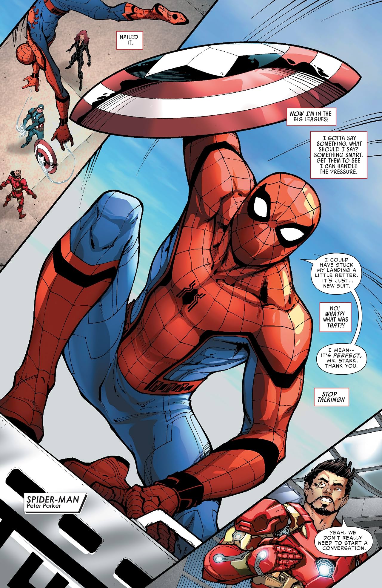
These are different poses for Spiderman, when creating characters no matter if their yours or someone else’s ideas you want to create different poses. the reason why is because you want to see every angle of the character and how they move. We see Spiderman web swinging, crouching and standing, this is to show how the character moves throughout in a comic book, animation or in a movie.

This is a background layout of a laboratory from the movie “The Shape of Water”, when making a background you should have some kind of design for your project. This background is not finished but it gives an idea of what the director wants for the movie and how he would like the scene to look like when he reveals the creature.

It may seem odd to include a story board if you are making a comic book, but I don’t find that odd, it’s important that you are working a storyboard that way you know that you have an idea of camera angles and shots you want in each scene for your final project.

I thought it would be interesting if the character would speak sign language, this doesn’t imply that the character is deaf or a mute. But to have him communicate with another character that does speak sign language. It’s still a working progress haven’t thought about yet but it’s still an idea to work with.

Stan Lee is an inspiration to the world of comics, he has inspired millions of people and to show just because someone is super, doesn’t mean they don’t have flaws. Stan Lee inspired me to create my own comic book characters and to be original. I hope one day I can have characters that are my own and to be inspiring.

I thought of using Latin words in my comic book because it would be different and have a unique language for people to speak. I haven’t made it official but the idea is still there just incase.

I chose this to show the different styles of each creator, Frank Miller’s style is dark, edgy and even tense to give the viewer of tough and dark world. While the one at the bottom is much lighter and everyone can read and have fun with. Each creator has there own type of style to create a comic in order to present it’s characters and its story.

This book I had since I was in high school, it was given to me by my art teacher who I am good friends with. This book showed me a lot on how I should create comic book characters and the layout. I found was an interesting technique was to get pictures of people in different poses, for instance someone holding a sword or posing for a fight scene and I have put that technique to good use when I want to create action poses. I advise anyone who is drawing comics, cartoons, or whatever should get this book and put it to good use.

This is a comic book script, just any other script you have to write down the scene along with dialogue and and what is happening in the scene itself. People think (I use to think the same) that you just create a panel and put drawings within the panels but no, you have to write down the scene just like you were creating a movie. This is the smartest way that comic expert is doing and every novice should learn this if they want to create comics for a living.


